Day2- Explanatory analysis and hypothesis testing
Walid Gharib - UniBe
library(ISwR)
library(MASS)
library(ggplot2)
library(Hmisc)
library(plotrix)
library(plotly)
library(Rmisc)
Explanatory analysis refreshings
Execute the following
install.packages("ISwR")
install.packages("Hmisc")
install.packages("MASS")
install.packages("plotly")
library(ISwR)
library(MASS)
library(ggplot2)
library(Hmisc)
library(plotly)
data(Cars93)
Statistical mind refreshings
SD standard deviation
Measure of dispersion of the data
\[σ = \sqrt{\frac{1}{N-1} \sum_{i=1}^N (x_i - \overline{x})^2}\]
sd(Cars93$Weight)SE standard error of the mean
Measure of precision of the estimate of the mean
\[ SE ={\frac{σ}{\sqrt{n}}}\]
std.error(Cars93$Weight)
## [1] 62.49719

#OR
sd(Cars93$Weight)/sqrt(length(Cars93$Weight))
CI confidence interval 95%
The confidence interval is based on the observations from a sample. The likelihood that the parameter will be in the interval is called confidence level. A confidence interval measures the probability that a population parameter will fall between two set values
\[µ ± 1.96 {\frac{σ}{\sqrt{n}}}\]
Example:
An example of a 95% confidence interval is shown below:
72.85 < μ < 107.15
There is good reason to believe that the population mean lies between these two bounds of 72.85 and 107.15 since 95% of the time confidence intervals contain the true mean.
In other words, if repeated samples samples where taken from a population and each computed for CI at 95% then 95% of these intervals are likely to contain the true mean of the whole population while 5% not.
c(mean(Cars93$Weight)-(1.96*sd(Cars93$Weight)/sqrt(length(Cars93$Weight))),
mean(Cars93$Weight)+(1.96*sd(Cars93$Weight)/sqrt(length(Cars93$Weight))))

# or simply by doing a t-test
t.test(Cars93$Weight)
Data first impressions
summary(Cars93)
car_mean <- tapply(Cars93$Weight,Cars93$Type,mean)
car_mean_1<- aggregate(Cars93$Weight~Cars93$Type, data = Cars93,FUN=mean)
car_sd <- tapply(Cars93$Weight,Cars93$Type,sd)
as.character(n_car)
n_car <- tapply(Cars93$Weight,Cars93$Type,length)
car_sem <- car_sd/sqrt(n_car)
# plot the barplot, arrows and add text
p <- ggplot(data = Cars93, aes(Type,Weight)) +
stat_summary(fun.y=mean,geom="bar")+
stat_summary(fun.data = mean_se, geom = "errorbar", width = 0.25)
print(p)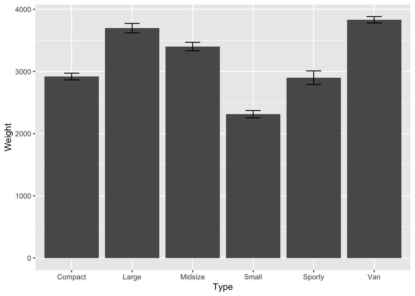
Q- Compute the standard deviation, the standard mean error and the confidence interval on the
Max.Pricevariable byTypeand draw the corresponding barplot
# standard deviation
sd(Cars93$Max.Price)
## [1] 9.959318

# standard error
(se <- std.error(Cars93$Max.Price))
## [1] 1.099823

# Confidence interval
c(mean(Cars93$Max.Price)-(1.96*se),mean(Cars93$Max.Price)+(1.96*se))
## [1] 17.01508 21.32638

## OR from the Rmisc package
CI(Cars93$Max.Price, ci = 0.95)


# plot
p <- ggplot(data = Cars93, aes(Type,Max.Price)) +
              stat_summary(fun.y=mean,geom="bar")+
              stat_summary(fun.data = mean_se, geom = "errorbar", width = 0.25)
print(p)
Quantiles & Boxplot
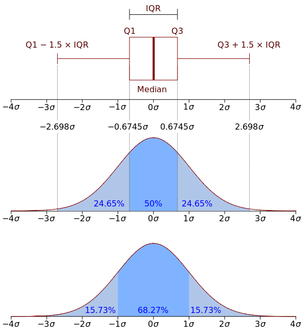
Different type of error bars

Introduction to statistics course - SIB
Boxplot
p <- ggplot(data = Cars93, aes(x="cars", y=Weight)) + geom_boxplot()
print(p)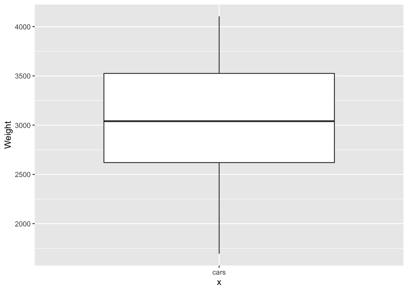
p <- ggplot(data = Cars93, aes(x="cars", y=Weight)) +geom_violin() + geom_boxplot(width=.1)
print(p)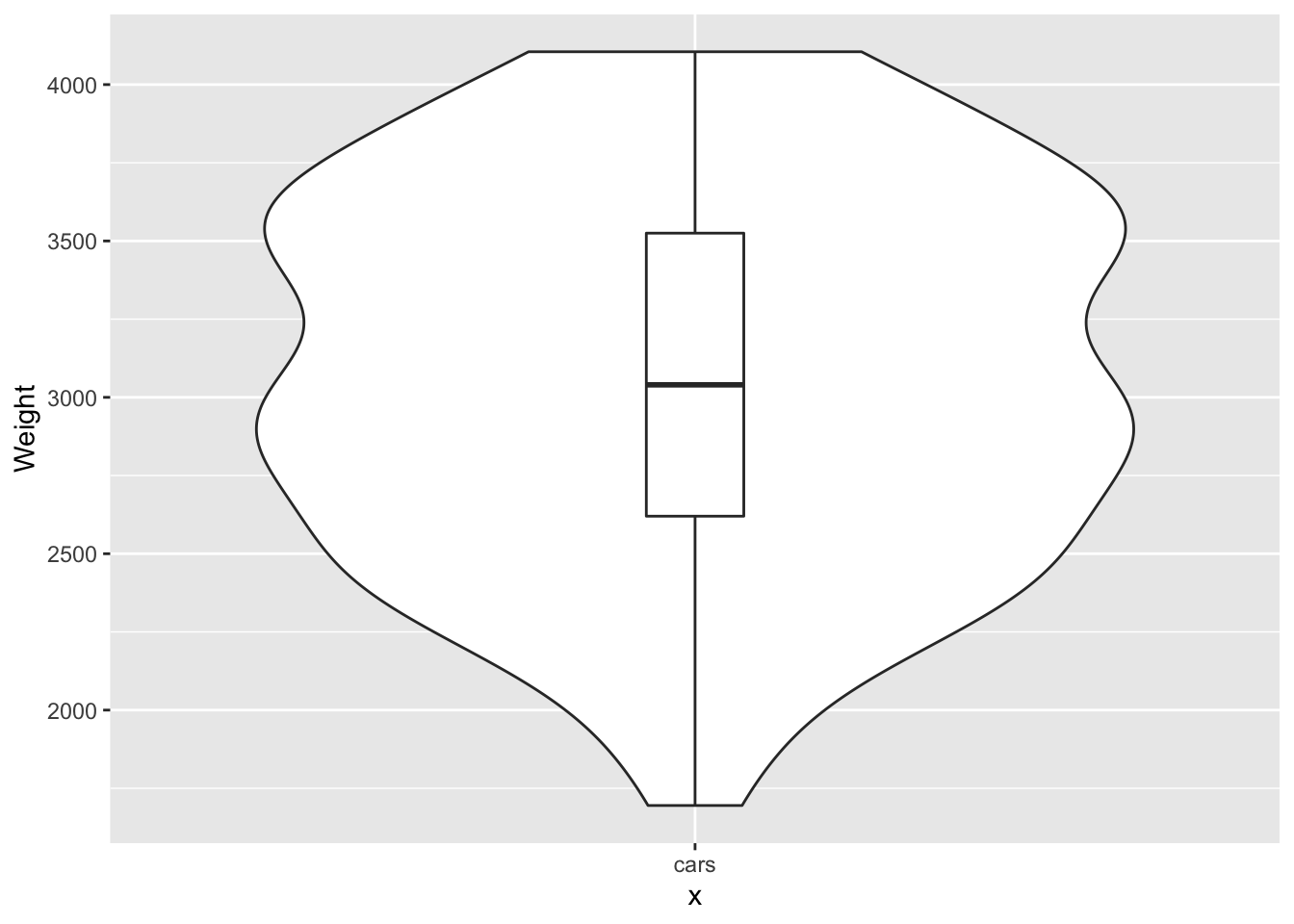
Q-1 Now let’s assume we would like to two box plots which shows the
$Originin function of the$Weight
p <- ggplot(data = Cars93, aes(Origin,Weight)) + geom_boxplot()
print(p)
Q-2 Now your trun to draw a box plots which shows the
$Typein function of the$Weightas drawn below
HINT
# to colour the boxes add `+ scale_fill_brewer(palette="Blues")`
p <- ggplot(data = Cars93, aes(Type,Weight,fill=Type)) + geom_boxplot() + scale_fill_brewer(palette="Blues")

print(p)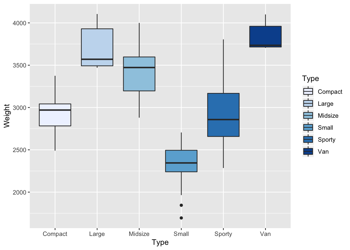
Q-3 Reproduce the similar boxplot of the above using violin plot adding the boxes inside
p <- p <- ggplot(data = Cars93, aes(Type,Weight,fill=Type))  + scale_fill_brewer(palette="Blues")  +geom_violin() + geom_boxplot(width=.1)
p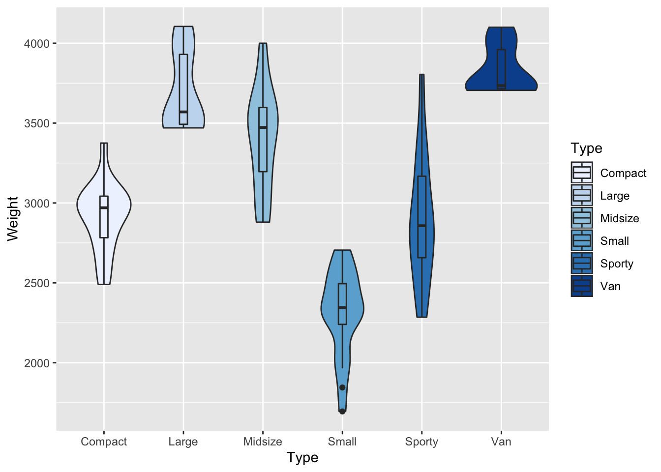
Plotly: an interactive way of plotting
p <- ggplot(data = Cars93, aes(Type,Weight,fill=Type)) + geom_boxplot() + scale_fill_brewer(palette="Blues")
p<-ggplotly(p)
layout(p)
##Exercice EDA
Q-1 Load
library(ISwR)and call thedata“hellung”, use also the?to get infos about the dataset
data(hellung)
?hellung
Q-2 Look at variables types in the dataset and get a first statistical impression on the dataset. by calcualting the mean of the columns and their standard deviation.
summary(hellung)
apply(hellung,2,mean)
apply(hellung,2,sd)
Q-3 Build two histograms of the variables
concanddiameterseperately. using the functiongeom_histogram()
# Concentration
p <- ggplot(data = hellung, aes(x= conc)) + geom_histogram( colour = "black", fill = "white")
p
# Diameter
p <- ggplot(data = hellung, aes(x= diameter)) + geom_histogram( colour = "black", fill = "white", bins = 30)
p
Q-4 Build boxplots of the variables
concanddiameterin function of the variableglucoseto be taken as afactorP.S. you can add attributes to the1and2occurences inglucosetoyesandnoas seen in?hellungusing the functionfactorwith the graph
# adding attributes yes an no
glucose_factor<-factor(hellung$glucose,labels=c("Glucose","No Glucose"))
# check if added
glucose_factor
#Build boxplot concentration
p <- ggplot(data = hellung, aes(y= conc, x=glucose_factor, fill=glucose_factor)) + geom_boxplot()
p
## Build boxplot diameter
p <- ggplot(data = hellung, aes(y= diameter, x=glucose_factor, fill=glucose_factor)) + geom_boxplot()
p
Q-5 Plot the
diameterin function of theconcwhat do you see? plot again using thelogscale on x and y what do you see
HINT Here we use the function geom_point() and NOT geom_boxplot()
#Without log scale
p <- ggplot(data = hellung, aes(x= conc,y=diameter, group=glucose_factor, label=glucose_factor, color=glucose_factor)) + geom_point()
p
#Build boxplot concentration
p <- ggplot(data = hellung, aes(x= conc,y=diameter, group=glucose_factor, label=glucose_factor, color=glucose_factor)) + geom_point() + scale_x_log10()+scale_y_log10()
p
Outliers bias
Q-1 import the
datacalledislandsand have a closer look at it
data(islands)
?islands
str(islands)
length(islands)
summary(islands)
boxplot(islands)
Q-2 Build a boxplot of
islands, remember this need to be transformed to data.frame beforehand
islands<-as.data.frame(islands)
str(islands)
p <- ggplot(data = islands, aes(x="islands", y=islands)) + geom_boxplot(outlier.shape = NA)
Q-3 What do you see, and how would you interpret this boxplot?, suggest a solution to the faced issue and implement it
First answer:
## log scaling
p <- ggplot(data = islands, aes(x="islands", y=log(islands))) + geom_boxplot()
p
Second answer: PS use boxplot.stats(islands$islands) and look $stats what does the numbers mean?, use also + coord_cartesian(ylim=c()) to extract the ouliers
summary(islands)
# find the quartiles
boxplot.stats(islands$islands)


## Get rid of the ouliers
boxplot.stats(islands$islands)$stats[c(1,5)]
p <- ggplot(data = islands, aes(x="islands", y=islands)) + geom_boxplot(outlier.shape = NA) + coord_cartesian(ylim=c(boxplot.stats(islands$islands)$stats[c(1,5)]))
p
For these paricular cases ggplot2 is not very user friendly while the normal R boxplot function is much easier to use e.g.
boxplot(islands,outline=FALSE)#Hypothesis testing
What is a hypothesis?
A hypothesis is a statement or claim that we would like to test it’s truthness
In order to test the truth of a statement in statistics, we need to implement two hypothesis:
- The Null Hypothesis (H0)
- The Alternative Hypothesis (H1)
The Null Hypothesis - H0
- Is the statement that is currently beleived to be TRUE
- Is the statement we beleive we can prove wrong
- It is still going to be TRUE if we do not prove otherwise
- Usually involves the
=
The Alternative Hypothesis - H1
- Involves the statement that we would like to test
- It is the statement you would like to promote as TRUE if you prove H0 wrong
- Involves
≠,<and>signs
For example:
| H0 | H1 |
|---|---|
| The coin is fair | The coin is biased |
| The effect of the body cream is the same as the placebo | the body cream is better than the placebo |
| The effect of the body cream is the same as the placebo | the body cream has not the same effect than the placebo |
| Heavy cars consume the sameamount of fuel than lighter cars | Heavy cars consume more fuel than lighter cars |
One or two sided Hypothesis testing
If the alternative Hypothesis has direction, that usually means it is one sided concretely if it includes > or < sign
else,
it is one sided
Which one(s) of the table examples is(are) two sided or one sided?
Compute the p-value using the relevant statistical test
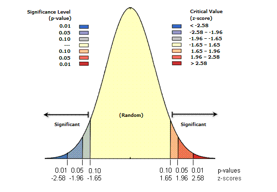
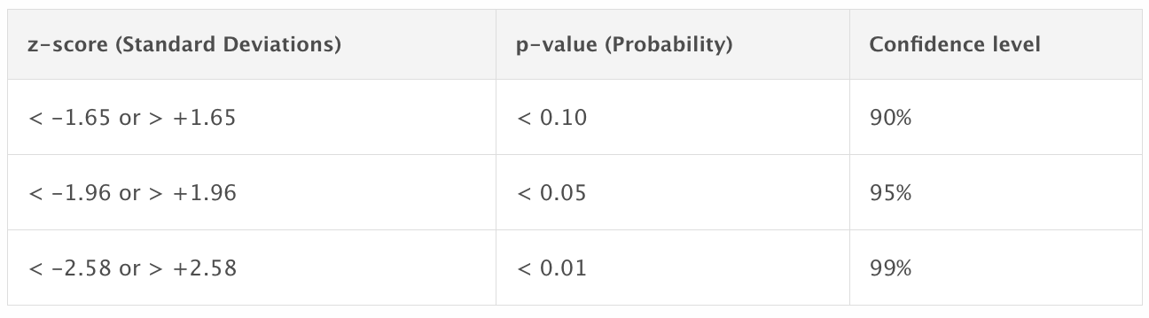
What is a p-value?
- The p-value is a probability to access the relevance of a statistical test
- Calculated based on the theoretical distribution of the test statistic
P-value is the probability of finding the observed, or more extreme, results when the null hypothesis (H0) of a study question is true
- it is not the probability that H0 is true.
- it is not the probability of making an error.
α = 0.05:
- if p > α that does not mean that H0 is TRUE, it mean that we cannot reject H0 considering the data
- if p < α that does not mean that H1 is TRUE, it mean that can reject H0 considering the data
Q- Why 0.05?
How do we choose the relevant statistical test?
Location test
- Widely used test
- Assumes data are normally distributed
It is called location test because it uses a location parameter which tells you where your graph is located. More specifically, it tells you where on the horizontal axis a graph is centered cite
So what test to use and in which cases
(test <- t.test(cars$Weight,mu=mu0,alternative = “two.sided”))
Example ONE-Sample
1) In the Cars93 dataset, does car weight differs from the agreed on value of 3000 pounds
2) In the Cars93 dataset, on average is the mileage less than 4 gallons per 100 miles
Example 1) One sample & Two-sided
- Set the hypothesis H0: µ=3000 against. H1: µ ≠ 3000
# define mu0
mu0=3000

t.test(Cars93$Weight,mu=mu0,alternative="two.sided")
One Sample t-test
data: Cars93$Weight
t = 17.54, df = 92, p-value < 2.2e-16
alternative hypothesis: true mean is not equal to 2000
95 percent confidence interval:
2951.415 3194.391
sample estimates:
mean of x
3072.903
Now try changing mu0 to 2000 and look at the difference
Example 1) One sample & one-sided “greater than”
- Set the hypothesis H0: µ=3000 against. H1: µ > 3000
mu0=3000

t.test(Cars93$Weight,mu=mu0,alternative="greater")
    One Sample t-test

data:  Cars93$Weight
t = 1.1918, df = 92, p-value = 0.1182
alternative hypothesis: true mean is greater than 3000
95 percent confidence interval:
 2971.265      Inf
sample estimates:
mean of x
 3072.903
Example 2) One sample & one-sided “smaller than” or “Greater than”
In the Cars93 dataset, on average is the mileage less or more than 5 gallons per 100 miles
- Set the hypothesis H0: µ=5 against. H1: µ < 5 and H1: µ > 5
mu0=5
t.test(Cars93$MPG.highway,mu=mu0,alternative="less")

t.test(Cars93$MPG.highway,mu=mu0,alternative="greater")
> t.test(Cars93$MPG.highway,mu=mu0,alternative="less")
One Sample t-test
data: Cars93$MPG.highway
t = 43.565, df = 92, p-value = 1
alternative hypothesis: true mean is less than 5
95 percent confidence interval:
-Inf 30.00467
sample estimates:
mean of x
29.08602
> t.test(Cars93$MPG.highway,mu=mu0,alternative="less")
One Sample t-test
data: Cars93$MPG.highway
t = 43.565, df = 92, p-value < 2.2e-16
alternative hypothesis: true mean is greater than 5
95 percent confidence interval:
28.16737 Inf
sample estimates:
mean of x
29.08602 Example TWO-Sample
Q- Are the non-USA cars are similar/lighter or heavier than those produced in the USA?
p <- ggplot(data = Cars93, aes(Origin,Weight)) + geom_boxplot()
print(p)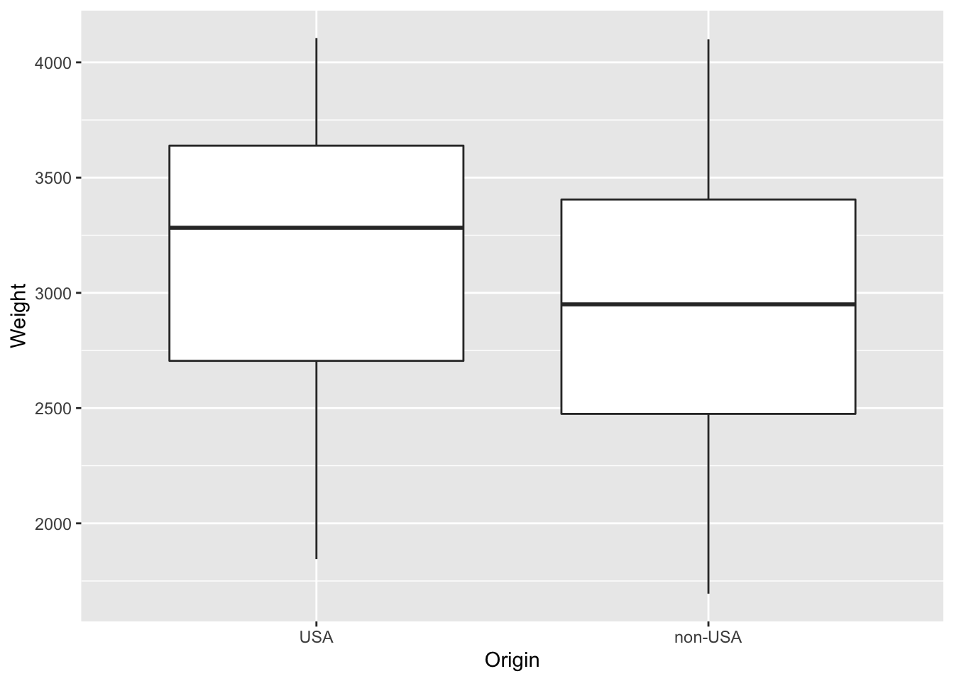
HINT
cars$Weight~cars$Origin# Similar
t.test(Cars93$Weight~Cars93$Origin)
# Less than
t.test(Cars93$Weight~Cars93$Origin,alternative="less")
# Greater than
t.test(Cars93$Weight~Cars93$Origin,alternative="greater")Q-1 Are Manual cars more fuel efficient than automatic cars?
HINT
1. Use the MPG.highway
2. levels(Cars93$Man.trans.avail)
#Hypothesis
# H0 : µ automatic = µ manual vs H1 : µ automatic < µ manual
t.test(Cars93$MPG.highway ~ Cars93$Man.trans.avail, alternative="less")Paired t-test
All the test above assumed that the variable we were testing comes from different individuals e.g. different car
The idea of paired data is contrasted with the usual association of one number to each data point as in other quantitative data sets in that each individual data point is associated with two numbers, allows scientists to observe the relationship between these variables in a population.Cite
for example each car in Car93 has a variable MPG.city and MPG.highway i.e. same car different place Another example would be the same patients under a certain drug and without it. i.e. different time points
- When used in the right way it is more powerful than the not paired
in R:
t.test(var1 ,var2 ,paired=TRUE)Q-2 Do cars have the same MPG efficiency inside or outside the city
#H0 : µ city = µ Highway vs H1 : µ city , µ Highway

t.test(Cars93$MPG.city ,Cars93$MPG.highway, paired= TRUE)
##How to assess normality?
Graphically
- using the command
qqnorm()followed by the commandqqline() - using hist()
Q-3 use
hist,qqnormfollowed byqqlineon$Length, what do you see
Histogram
# Histpgram
hist(Cars93$Length, breaks = 50, probability = TRUE)
lines(density(Cars93$Length))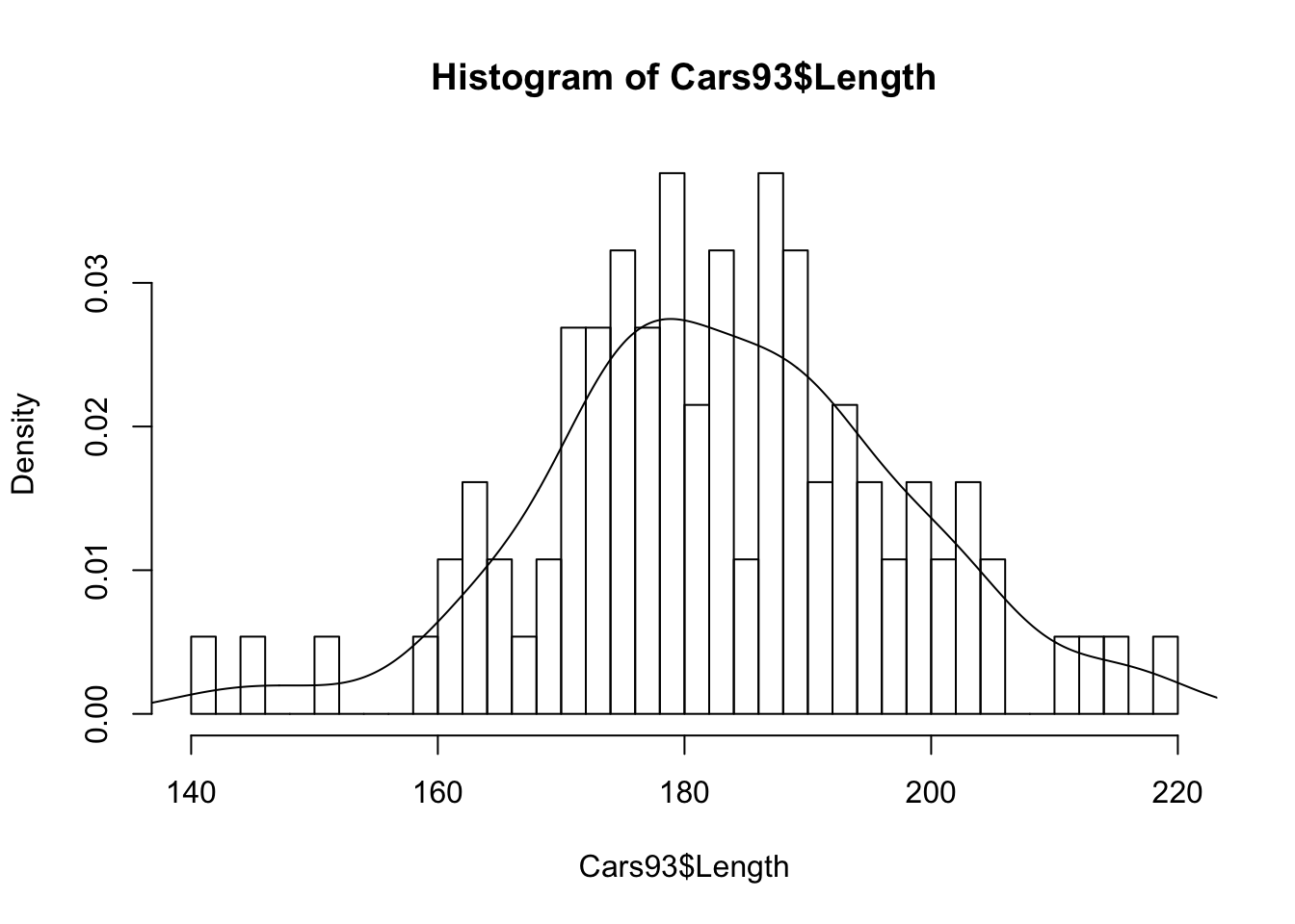 Q-Q plot
## Q-Q plot
qqnorm(Cars93$Length)
qqline(Cars93$Length)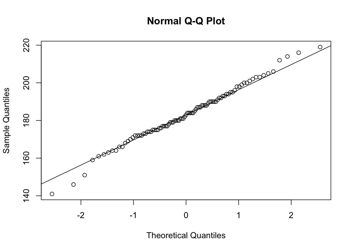
Statistical tests
Shapiro.test and Kolmogorov-Smirnov ks.test
shapiro.test(Cars93$Length) Shapiro-Wilk normality test
data: Cars93$Length
W = 0.99098, p-value = 0.7839ks.test(Cars93$,"pnorm",mean(Cars93$Length),sd(Cars93$Length)) One-sample Kolmogorov-Smirnov test
data: Cars93$Length
D = 0.060163, p-value = 0.8894
alternative hypothesis: two-sidedTransform the data using log
- Highly asymetrical data (skewed)
- Data spanning over several order of magnitudes
- Reduce the effect of ouliers
Try the Shapiro.test
Q-4 Try the
Shapiro.teston the$MPG.highwaywith and withoutlog, what do you see
#without log
Shapiro.test(Cars93$Length)

# with log scale
Shapiro.test(log(Cars93$Length))
Q-5 data(energy)
- Explore the
data(energy)- Build box plots for usingstature, Q-Q plot (qqnorm+qqline), histogram with density line. What do you conclude- Carry out a test to compare the energy expenditure between lean and obese women, is it significantly different between Obese and lean women, does it reflects what we graphically observe
definition Energy expenditure is the amount of energy (or calories) that a person needs to carry out a physical function such as breathing, circulating blood, digesting food, or physical movement.
Explore
?energy
boxplot(energy$expend~energy$stature)
qqnorm(energy$expend)
qqline(energy$expend)
hist(energy$expend,freq=FALSE)
lines(density(energy$expend),col="red")
test
t.test(energy$expend~energy$stature)NO normality
Even after trying to log the data (no Normality)
Wilcoxon test
The Wilcoxon Rank Sum Test is often described as the non-parametric version of the two-sample t-test. You sometimes see it in analysis flowcharts after a question such as “is your data normal?” A “no” branch off this question will recommend a Wilcoxon test if you’re comparing two groups of continuous measures.
The Wilcoxon rank sum test does not assume any know distribution:
- Assumes that samples are indepenant from each other (for multiple sample) (also true for t-test)
- To populations have equal variance (also true for t-test)
- No distribution required (not true for t-test)
Wilcoxon test - 1 sample
In R very similar usage of t.test
wilcox.test(Cars9$Weight, mu=3000) Wilcoxon signed rank test with continuity correction
data: Cars93$Weight
V = 2496, p-value = 0.2349
alternative hypothesis: true location is not equal to 3000NOTE: The V is the sum of all the Weight values - µ
Wilcoxon test - 2 sample
wilcox.test(Cars93$Weight[Cars93$Origin=="USA"] ,Cars93$Weight[Cars93$Origin=="non-USA"])***cannot compute exact p-value with ties***
Wilcoxon rank sum test with continuity correction
data: Cars93$Weight[Cars93$Origin == "USA"] and Cars93$Weight[Cars93$Origin == "non-USA"]
W = 1331.5, p-value = 0.05364
alternative hypothesis: true location shift is not equal to 0Wilcoxon test - Paired
wilcox.test(Cars93$MPG.city,Cars93$MPG.highway,paired=TRUE)Q-6 data(react)
Start off by looking at some simple summary statistics: mean, sd, quantile. Might these data be approximately normally distributed?
library(ISwR)
data(react)
?react
react
summary(react)
qqnorm(react)
qqline(react)
Q-7 Assuming that the dataset is from a normal distribution, does the mean differ significantly from zero?
t.test(react,mu=0)

#The p-value being smaller than 5%, we reject the null hypothesis.
Q-8 Perform a Shapiro-Wilks test to assess the normality of the dataset.
shapiro.test(react)

#The null hypothesis (H0 : the data come from a normal distribution) is rejected. According to this test, we cannot assume that the data come from a normal distribution
Q-9 Using a non-parametric test this time, does the mean differ significantly from zero?
wilcox.test(react,mu=0)Not continuous Data
- Counts data
- Contingency tables
Fisher’s exact test
Gives exact p-values
Approximate p-values
Not valid for small numbers
Does the fact that the car is American influence the transmission?
# H0 : The variables are independent vs H1 : Transmission type is a dependant of the origin of car

#execute this
Transmission_origin_counts <- as.data.frame.matrix(table(Cars93$Man.trans.avail,Cars93$Origin))

fisher.test(Transmission_origin_counts)
The p-value calculated for the test provides evidence against the assumption of independence. In this example this means that we cant confidently claim difference in availability of manual transmission depending wether the car is USA or non-USA
Chi square test
Fisher’s exact test is more accurate than the chi-square test of independence when the expected numbers are small. I recommend you use Fisher’s exact test when the total sample size is less than 1000, and use the chi-square for larger sample sizes cite
- Chisquare is not valid for < 5 counts
Does the fact that the car is American influence the transmission?
# H0 : The variables are independent vs H1 : Transmission type is a dependant of the origin of car

#execute this
Transmission_origin_counts <- as.data.frame.matrix(table(Cars93$Man.trans.avail,Cars93$Origin))

#Chisqtest
chisq.test(Transmission_origin_counts)
Q-10
In 747 cases of “Rocky Mountain spotted fever” from the western United States, 210 patients died. Out of 661 cases from the eastern United States, 122 died. Is the difference statistically significant?
Rmsp<-matrix(c(210,747-210,122, 661-122),2, dimnames = list(c("died","lived"),c("Western","Eastern")))
fisher.test(Rmsp)
# REJECT the NULL Hypthesis of variable independency, difference is significant
Q-11 Compute the chisq2 test and Fisher’s exact on the effect of treatment on ulcer test and discuss the difference
Two drugs for the treatment of peptic ulcer were compared (Campbell and Machin, 1993, p. 72). The results were as follows:
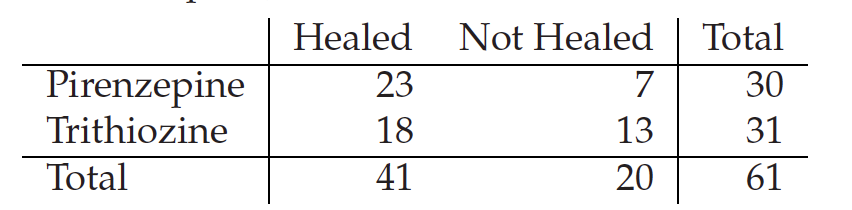
contigency_table<-matrix(c(23,18,7,13), 2,dimnames = list(c("Pirenzepine","Trithiozine"),c("Healed","Not Healed")))

chisq.test(contigency_table)
fisher.test(contigency_table)

#Both the chi-square and the Fisher’s test do not reject the null hypothesis that the treatment and health status are independent. There is therefore no evidence of an effect of the drugs on health status.
#Summary of Hypothesis testing
- Define the null and the alternative hypotheses
- Construct the test statistic
- Compute the p-value
- Decide whether to reject or not the null hypothesis
Anova (ANalysis Of VAriance)
Comparing the means of Multiple samples download this dataset
It is about weight loss using four different diets
Q-12 Import the data into R
read.table()and use theattach()
weightDiet<-read.table("/Users/wgharib/switchdrive/R-course/data/DietWeigthLoss.txt", header=TRUE, sep = "\t")

attach(weightDiet)
str(weightDiet)
To explore the relationship between weight Loss and diet types (A, B, C and D), using the ANOVA test
aov()command
As always the first thing to do is to explore the data
Q-13 Draw a box plot
p <- ggplot(data = weightDiet, aes(Diet,WeightLoss,fill=Diet)) + geom_boxplot() + scale_fill_brewer(palette="orange")

print(p)
Set the hypothesis
H0: Mean Weight loss is the same for all diets
H1: Mean Weight loss is differs between diets
ANOVA1<-aov(WeightLoss~Diet)
summary(ANOVA1)
Df Sum Sq Mean Sq F value Pr(>F)
Diet 3 97.33 32.44 6.118 0.00113 **
Residuals 56 296.99 5.30
---
Signif. codes: 0 ‘***’ 0.001 ‘**’ 0.01 ‘*’ 0.05 ‘.’ 0.1 ‘ ’ 1- We can reject H0 saying that all diets means are similar
- We can also see which of these diets stand out
Which of these diets is different?
For that we need to conduct all paiwise comparison between each diets and weight loss luckily in R we can do it using TukeyHSD() command
TukeyHSD(ANOVA1)by default it is 95% CI, and all differences in means are shown
  Tukey multiple comparisons of means
    95% family-wise confidence level

Fit: aov(formula = WeightLoss ~ Diet)

$Diet
          diff        lwr       upr     p adj
B-A -0.2733333 -2.4999391 1.9532725 0.9880087
C-A  2.9333333  0.7067275 5.1599391 0.0051336
D-A  1.3600000 -0.8666058 3.5866058 0.3773706
C-B  3.2066667  0.9800609 5.4332725 0.0019015
D-B  1.6333333 -0.5932725 3.8599391 0.2224287
D-C -1.5733333 -3.7999391 0.6532725 0.2521236
We can also easy plot the TukeyHSD(ANOVA1)
ANOVA1<-aov(WeightLoss~Diet)
plot(TukeyHSD(ANOVA1))
For non parametric test (i.e. data is not normally distributed), we can use Kruskal-Wallis one-way analysis of variance
kruskal.test(WeightLoss~Diet)